We believe that it would be a mistake to treat this space in such a way that its character would lose its “otherness” from the more urbanised parts of the city.
We are overlooking ecological considerations both at the level of the representation of ideas (a wedge of natural land cutting into the very centre of the city) and at a strictly utilitarian level (ventilation of the city).
Already at the cultural level, the existing situation of ‘otherness’ is sufficiently interesting and intriguing for us to search for the new. Designing new development on the basis of classic patterns, whether it be 19th century quarter buildings or functionalist modernist buildings, could lead to a loss of the above-described richness that we find in the de-urbanisation of this space.
When designing the development of the area, we took into account the fact that in the immediate vicinity there is the Na Grobli Water Tower. Its phenomenon functions “in our opinion”, among other things, due to the context of its location. The Water Tower functions as a single architectural sign. The more it is located in a “non-urbanised” space, the stronger its effect. The Pressure Tower surpasses everything around it not only in its scale and height but above all in its ‘otherness’.
We believe that the development area needs such independent architectural “signs”. Stand-alone buildings growing out of the surrounding greenery. “Signs” that do not seek a relationship with the buildings on the other side of the river, i.e. with the city.
In accordance with the competition guidelines, the new administrative and service buildings were located in the southern part of the area under development. From this side, i.e. from Frog Path Street, access and access for customers and employees were designed. The entrances to both buildings (ZiA and BOK) have been designed separately. However, from a structural point of view, the buildings form one whole (they are functionally connected at the level of the underground car park).
On the south-eastern side, in front of the entrance to the above-mentioned buildings, a public space was designed in the form of a paved square with squares of cultivated greenery. “Piazzetta” partially enters under the overhanging storeys of the ZiA building. Along the square, a customer parking area (12 m.p.h.) has been designed. In the covered part, bicycle racks will be set up in an irregular composition.
Along the eastern boundary of the plot, an internal access street with limited access for outsiders has been designed (in the ground floor of the ZiA building, a porter’s lodge has been designed together with a security station – a common room). Employees arriving to work by car will park in the underground or above-ground garage (basement under the ZiA and BOK buildings and the first floor of the ZiA building). A total of 98 m.p.h. was designed in both car parks. In addition, 214 m.p.h. were designed for passenger cars at ground level, with the largest number of them located between the ZiA and BLT buildings and the Oława river (107 m.p.h.). The majority of the parking spaces in this section are designed with etched Ecoraster paving blocks. The total number of parking spaces for cars is 312.
A transport and logistics base (BLK) was designed in the central part of the site, which naturally separates the administrative and service part of the site (south) from the transport and technical part (north).
The main entrance for trucks was located from the north, i.e. Na Grobli Street. Transport service within the area on the basis of one- and two-way streets. The main motor traffic axis is the previously mentioned internal street along the eastern boundary of the development. In the central part of the area, it surrounds the BLK building. The space between the street and the building is a paved maneuvering area with external workshop car parks (C039), a reserve for a free-standing pass-through car wash (as an alternative to the designed car wash within the transport and logistics base), accesses to garages, workshops and warehouses. The BLK building was additionally designed with an internal manoeuvring space in the form of an “alley” separating the ground floor of the building into two parts, above which run the longitudinal cuboids of the first floor with office and back-up rooms. Along the west elevation of the BLK, a storage field for sand and soil is located with access from the north (a large manoeuvring area to serve only the above-mentioned fields C066 and C067).
To the north, the square reaches the forklift-accessible shed building (storage area C 061). The entrance gates of the shed are located on the east side. The maneuvering area between storage bays C066 and C067 has a different purpose than the area in front of storage bay C061, so they are functionally separate.
The truck parking areas are located in the northern part of the site, between the newly designed shed building with storage field C061 and the existing Level II pumping station building. The majority of the parking spaces are designed as through parking, with access via one-way streets. Thirty-five (designated) truck parking bays of 16.5m, 36 bays of 10.5m and 3 bays of 18m have been designed. In addition, there is the possibility of emergency car parking in the area of the manoeuvring yards around the BLK.
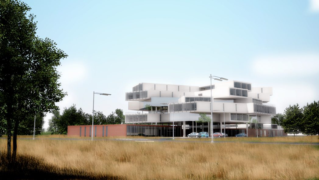
In urban and architectural terms, the development of the site is based on the separation of separate building structures finished at ground floor level with clinker brick cladding, analogous to the existing historic clean water tanks and other historic buildings (primarily the Pressure Tower). This is to be reinforced by the “identical”, almost “eclectic” treatment of the ground floor level facades (clinker). “New” appears higher up. However, despite the use of a completely new architectural language, here too there is a kind of continuity. Above ground floor level, the projected buildings (above all the ZiA building) continue the phenomenon of the “Pressure Tower” as an independent element in space. An independent “sign” growing out of the surrounding greenery.
In the bird’s-eye visualisations, the clinker-brick cladding of the ground-floor parts of the buildings is highlighted in yellow.
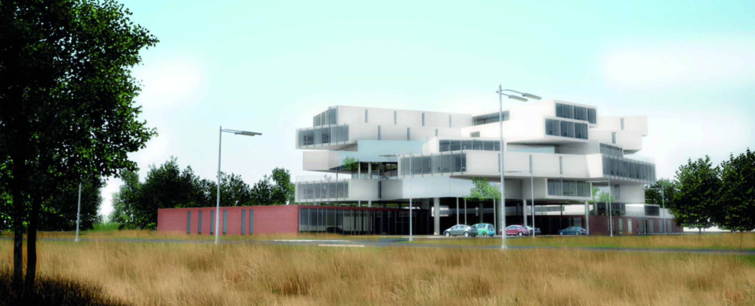
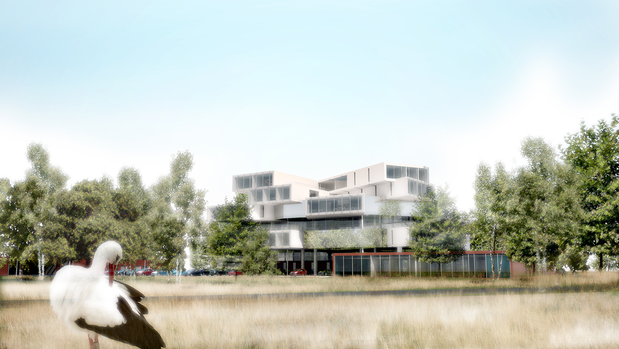
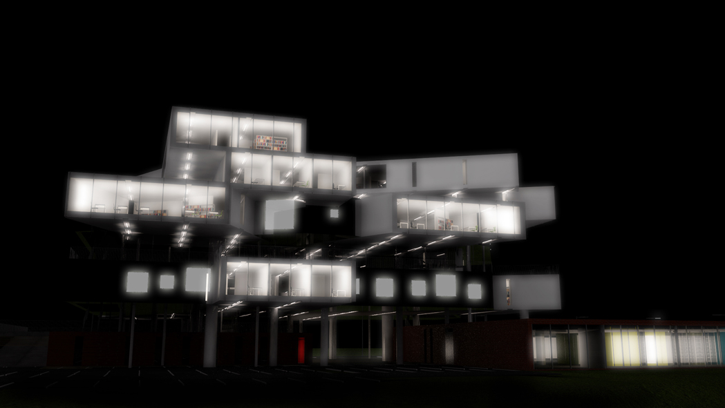
The most striking element of the project is the new ZiA building. It will make a noticeable architectural ‘mark’. Self-contained and independent. Its ‘individuality’ stems from the comments in the context section.
In our view, it should not emphasise any direction. Its very scale (an area of about 10,000m2) determines that it will be a large building which, in the context of the lack of other development on this part of the river, is tantamount to accepting a major change at this location. The question is, however, what kind of change? In our opinion, the new building cannot, as we have already written, ‘extend’ the ‘urban’ development to this side of the river.
The designed building was based on a single spatial-construction module, which was transformed several times during the design work by copying, rotating and moving it.
On each storey above ground (starting from the second floor), the internal space will be dominated by a “basic module”, which is a four-arm concrete “frame” with an internal dimension of 11.5×2.9m, which is a prestressed concrete structure. According to preliminary static calculations, the floor slab thicknesses will be approximately 30cm. Additional reinforcing structures in the form of thin steel studs are allowed, but these will only appear in critical positions. Each arm will open in a different direction, opening up to different parts of the world (sunlight available throughout the day, openings to the outside (south to the “piazzetta” in front of the building, east to the greenery of the allotments, west to the river and further to the city, and finally north to the Press Tower). The partition walls in the middle of each module will be lightweight partitions with the possibility of simply removing or changing them (interior flexibility). Large office spaces (instead of separate rooms) could be an equally good solution. In such a solution, it would be possible to feel the greenery surrounding the building from everywhere. Due to the competition conditions, however, the design solutions show a variant with separate rooms (partly with glass partitions equipped with internal blinds).
The basic functional scheme of the building is based on the distribution of the various functions on the different floors so that they can form independent spatial units (in the horizontal directions) while at the same time connecting them in the vertical direction by means of an internal patio with stairs and panoramic lifts. The patio will constitute the only vertical communication riser of the building used on a daily basis. The other communication risers will be external emergency staircases located on opposite sides of the building and making use of the building’s mass differentiation in places (terraced layout on the south side).
